
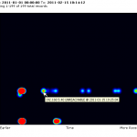
 One of the cool things we’ve been working on for Nagios XI 2011 is an alert heatmap that provides a visual representation of alerts over time.
Representing alerts in a visual manner can provide users with a quick understanding of when major events occurred, and which hosts and services have persistent problems.
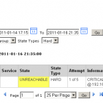
Alerts are plotted by time along the horizontal axis. Hovering over a spot on the heatmap will bring up a tooltip that displays information on the alert. Clicking on the spot will redirect the user to the state history page where they can investigate the alert further.


0 Responses to “Visualizing Alerts With The Nagios XI Heatmap”